Table of Contents
What's included?
Different types
Good business in 2024?



Energy Ecosystem
Led end-to-end UX/UI design for Inavitas' energy monitoring ecosystem, spanning a data-rich web dashboard for deep analysis and a mobile app built for the field, unified by one design system and built around the same core users.
Company
Inavitas
Timeline
2022
Type
Web Dashboard + Mobile App
Goal
Give plant operators and energy managers one consistent way to monitor real-time energy performance, catch faults fast, and stay in control, whether they're at a desk or out in the field.
UNDERSTANDING THE USERS
Plant operators and energy managers need one thing above all: clarity, fast. Whether they're reviewing performance at a desk or checking on something mid-task in the field, the same core question shaped every decision: what needs to be visible instantly, and what can stay a click away.
Energy monitoring isn't a field most people encounter day to day, so before designing a single screen, I had to build real domain knowledge, understanding fault patterns, reporting needs, and how operators actually think under pressure.
Overview
A redesign of Inavitas' energy monitoring ecosystem, spanning a web dashboard and a mobile app, both built to make energy and plant monitoring faster and clearer, wherever the user is.
users
The ecosystem serves a small, specialized audience: technically informed field workers and administrative professionals, each with different needs depending on where and how they work.
Educated field workers
Field workers use the mobile app to track energy production and consumption on the go, and to catch errors before they escalate.
Administrators & managers
Administrators rely on the web dashboard to track profits and income, and manage energy rates efficiently.
CHALLENGES
Pinpointing exact needs and finding interview subjects within such a niche user group was consistently difficult.
Everything at once
As this is a monitoring website, users expect to be able to view all the important data at first glance, which can lead to data pollution in the UI.
Small and niche target group
The user group is small and highly specialized, technically informed people in energy management. That made it harder to gather diverse feedback, risking gaps in understanding the full range of user needs.
Requiring knowledge about the field
Energy monitoring isn't something most people encounter day to day, so I had to build real domain knowledge before I could design the interface with confidence.
DESIGN SYSTEM CREATION
Analyzing the existing apps made one thing clear: they needed a shared design language.
Consistency
As UX/UI designer for Inavitas, I led the creation of a comprehensive design system to establish consistency across web and mobile.
Scalability
Since Inavitas' products span phones, tablets, and desktops, the system was built responsively from the start, adapting smoothly to every application
Brand-product alignment
I aligned the color palette closely with Inavitas' brand identity to keep the experience visually cohesive. The design system became the foundation for development, speeding up iteration and keeping every product on-brand.
DESIGN DECISIONS
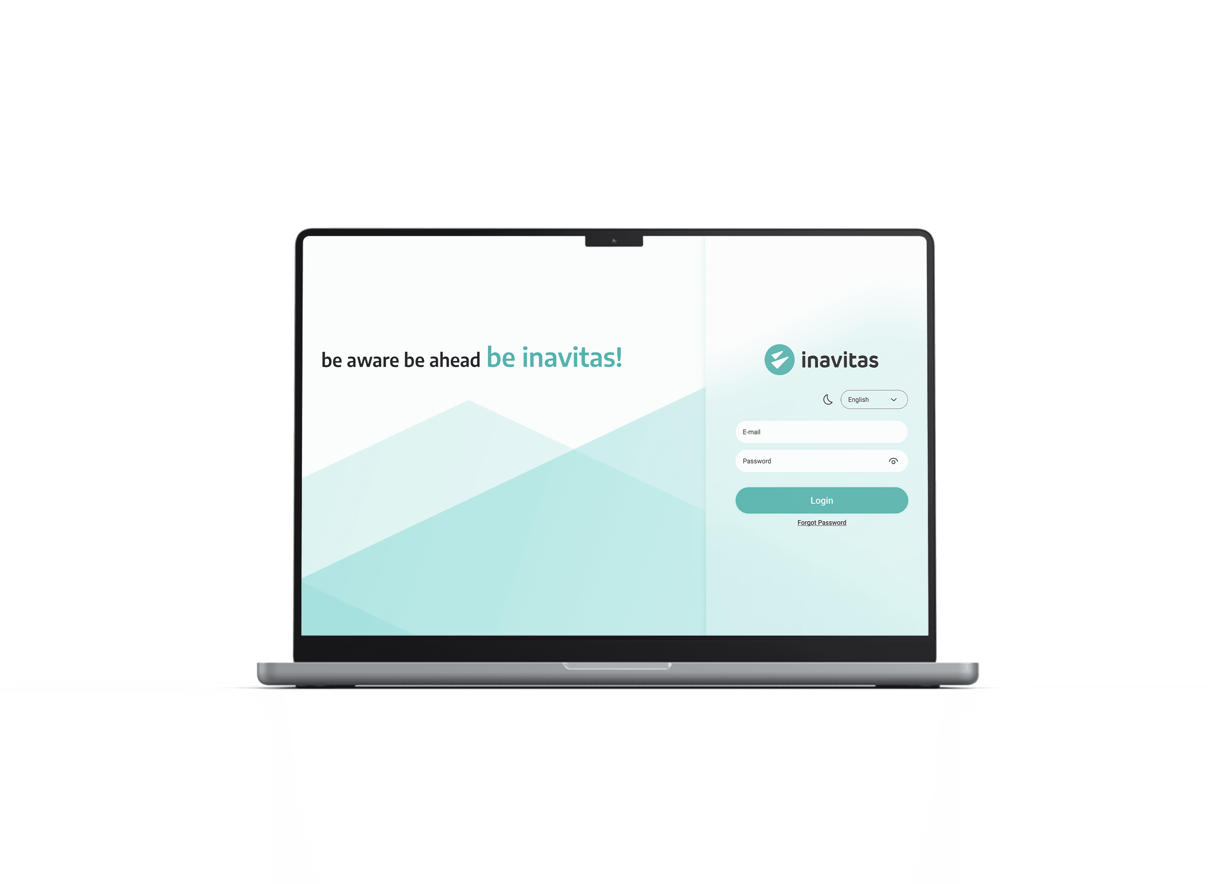
Following brand guidelines, I created a new UI for the app.
Accessibility for all
Accessibility was built in from day one, high-contrast interfaces, adjustable font sizes, and full keyboard navigation, so the Inavitas Energy Management System works for the widest range of users possible.
A sleek UI design that communicates innovation
SF Pro Display runs throughout the app, chosen for its clean, modern feel and the readability it brings to every screen.
Crafting a design system
The design system brings together standardized components, typography, color, and interaction patterns into one framework for developing every application in the ecosystem.
ın the end